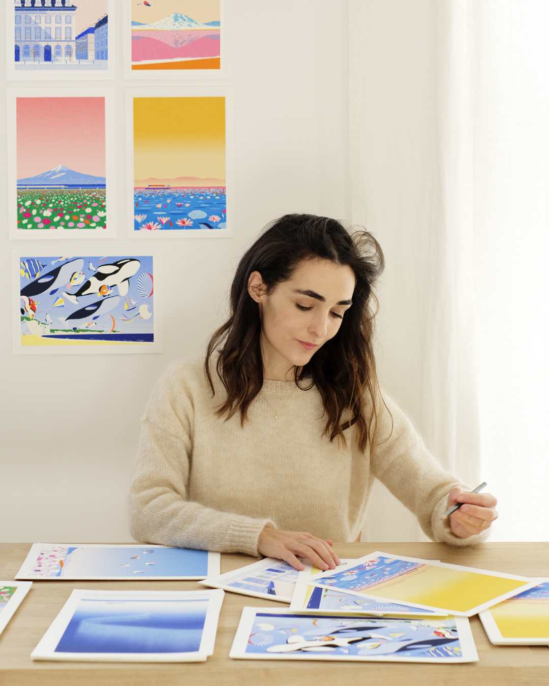
Can you introduce yourself?
Hello, my name is Julie. I grew up in La Rochelle and studied at the Ecole Nationale Supérieure des Arts Décoratifs in Paris. I also lived in Vienna for 2 years before returning to live and work as an illustrator in Paris.
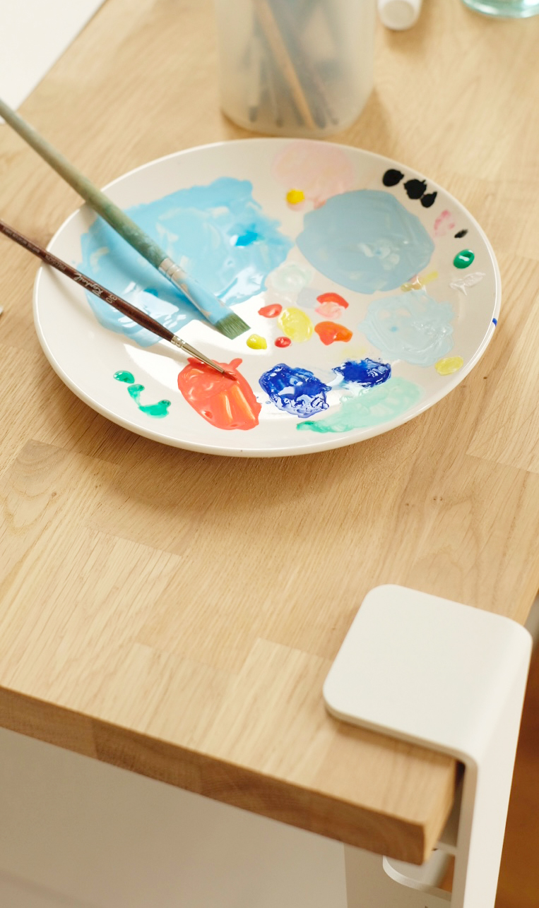
How would you define your creative universe?
My universe is rather colorful and poetic. Travel and elsewhere are themes that are very present in my work, a pretext to try different color palettes, compositions, and subjects, whether through landscapes or architectures.
Where do you find your inspiration?
I mainly draw inspiration from my surroundings, what I listen to or watch, through the radio, movies, books, or exhibitions. I also take a lot of photos of details, colors, and atmospheres that I later use in my illustrations.
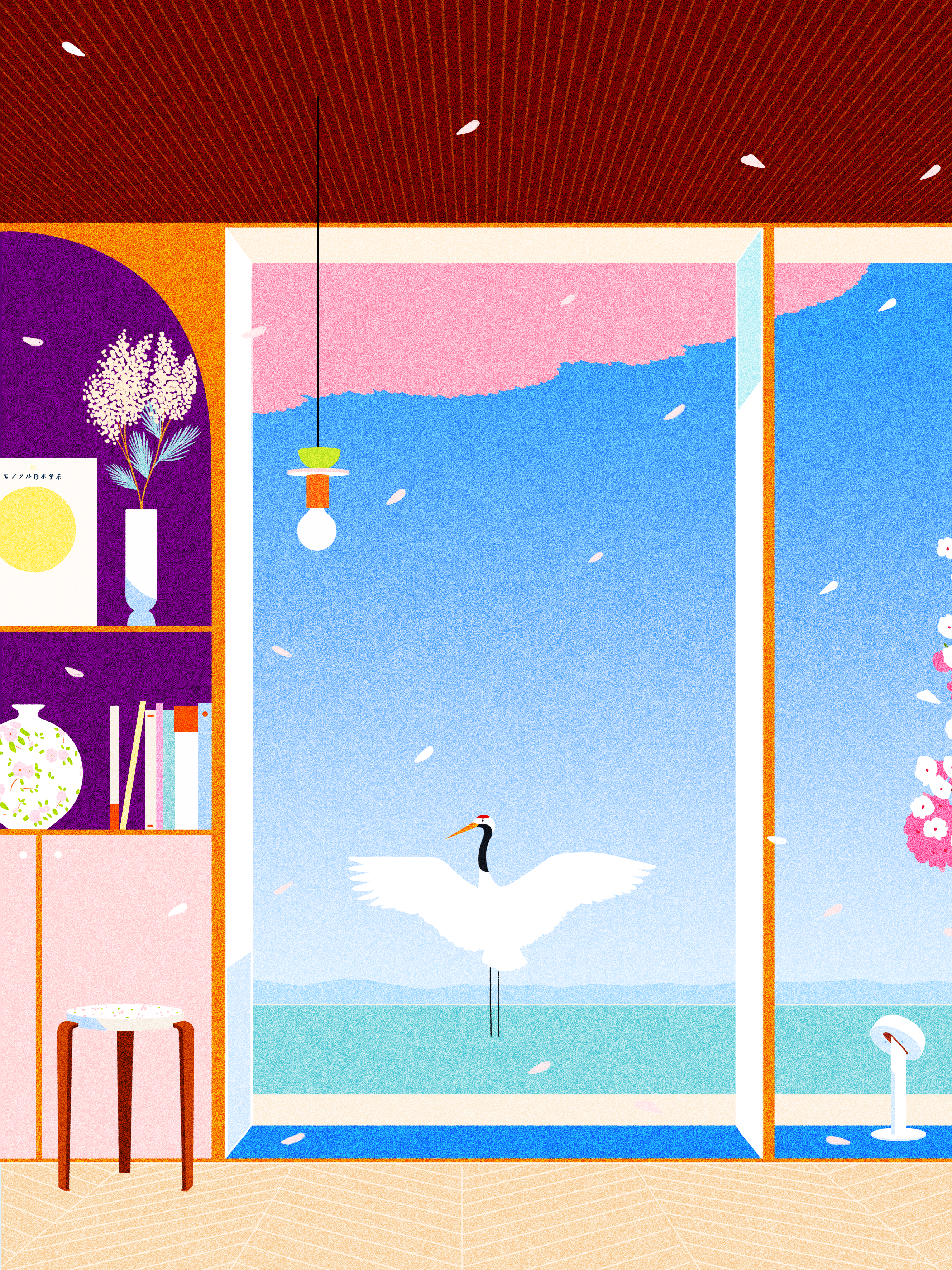
Why did you decide to represent these TIPTOE objects?
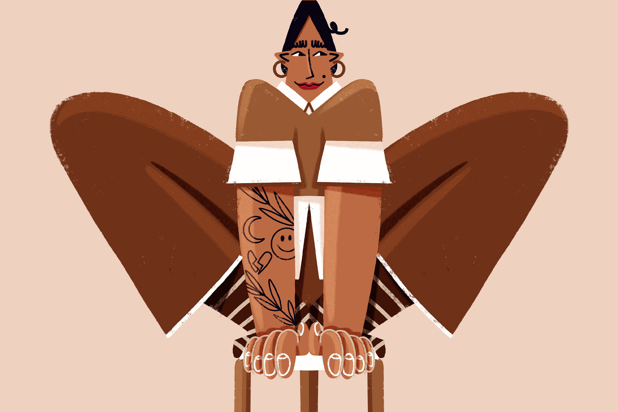
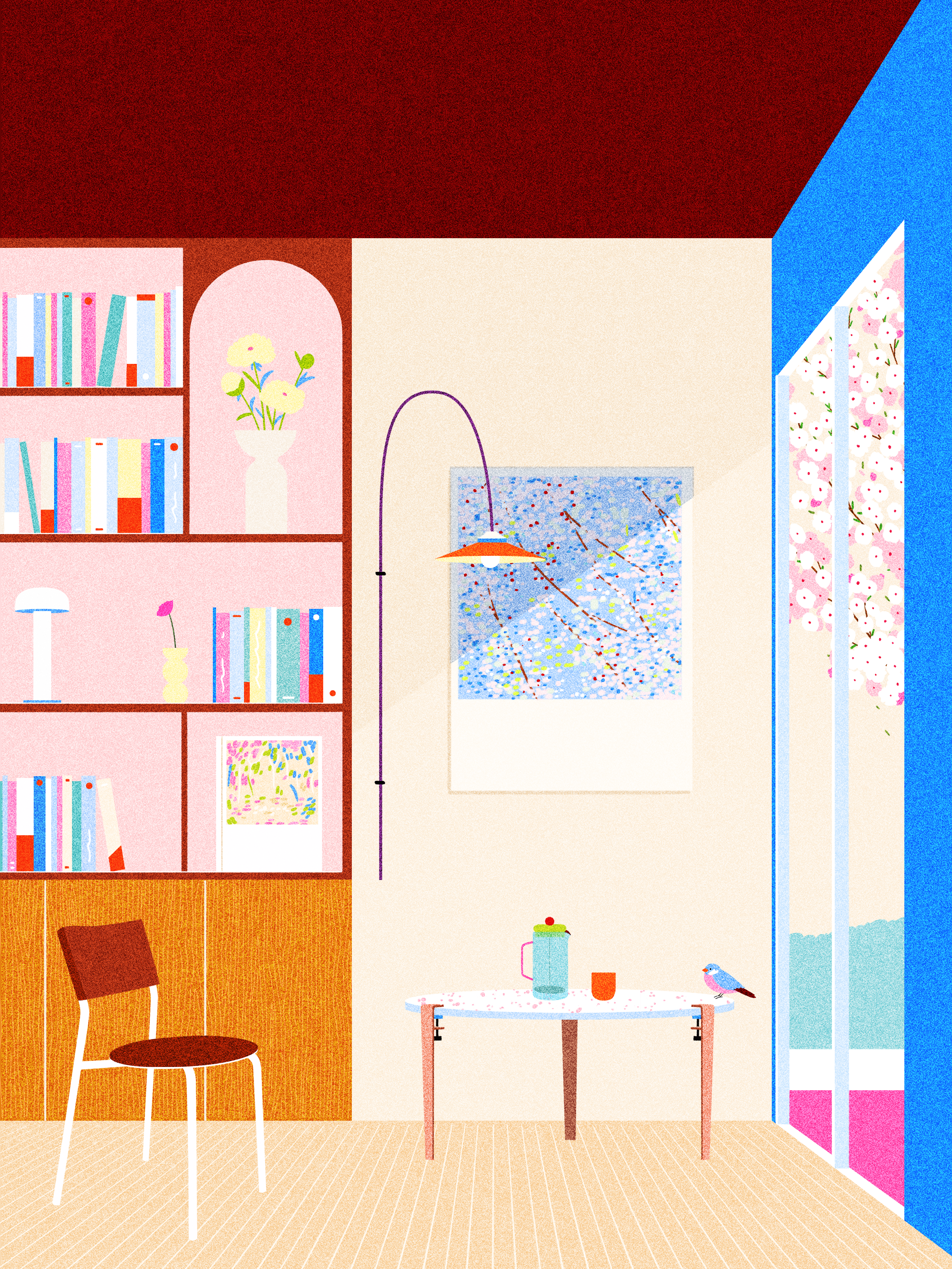
I represented these objects because I really like them; their shape is very sleek and works quite well with my universe. I particularly liked the colors from the collaboration with the architect duo Heju, which inspired me for the palette of illustrations.
What visions do you have of TIPTOE?
For me, TIPTOE represents objects that adapt and evolve along with our interior. A fairly simple idea with a very effective design and a real commitment to the use of sustainable materials.
Any creative recommendations?
I recently bought the book “Vertigo of Color, Matisse, Derain”, which brings together paintings, drawings, and watercolors from both painters; the colors are amazing, I highly recommend it.
A place where you feel good?
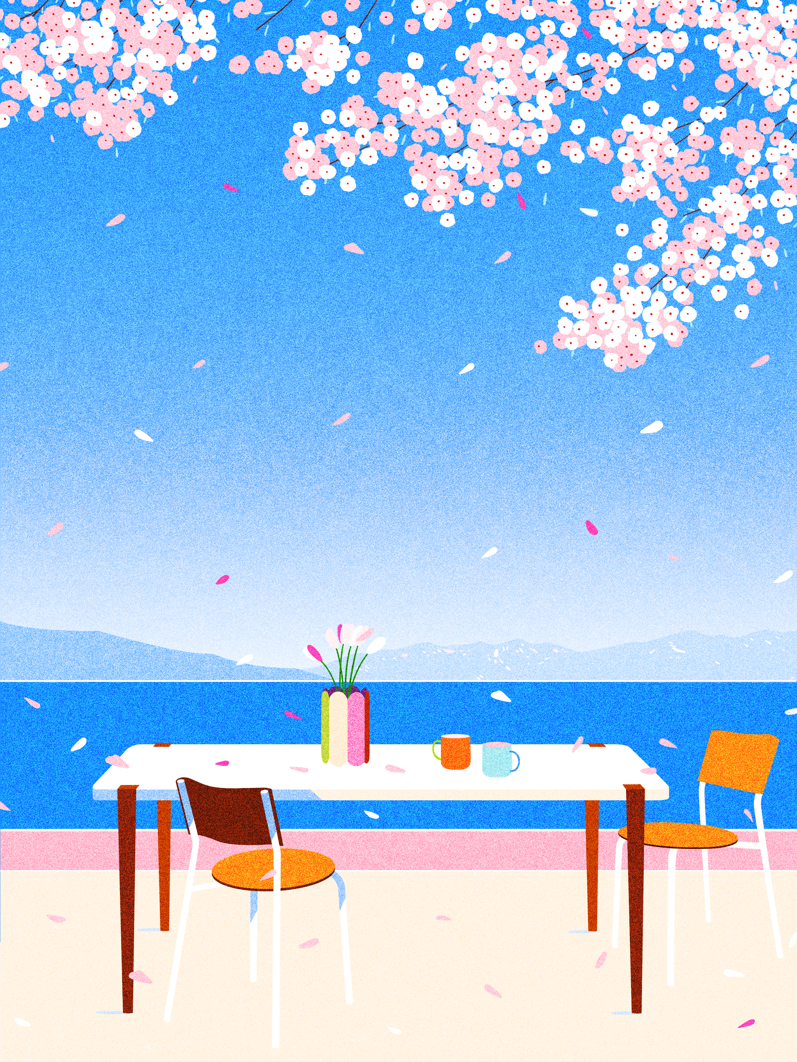
I would say Paris; it has become my adopted city. I love walking and crossing the city; there are always streets, squares, and buildings that I discover. And the pink sky still amazes me just as much. While creating these illustrations, I thought back to the plum tree that was in front of my room in La Rochelle. The little pink and white flowers filled the blue sky and announced the arrival of spring.
